11 Minute
When it comes to building a brand, colour is not just decoration — it’s communication.
The colours you choose set the tone for how people feel about your business before they even read a single word. Whether you’re launching a startup, refreshing an existing identity, or creating visuals for social media, your colour palette plays a vital role in defining who you are and what you stand for.
Colour psychology shows that people make subconscious judgments about a product or brand within the first few seconds — and up to 90% of that judgment is based on colour.
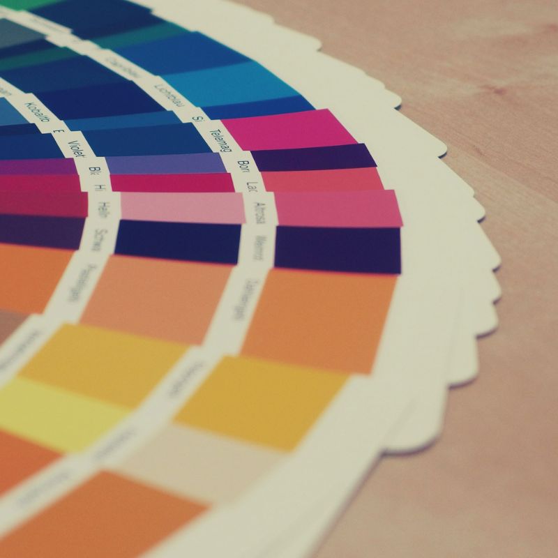
Red evokes passion, energy, and urgency.
Blue represents trust, calm, and professionalism.
Green conveys growth, health, and balance.
Yellow expresses optimism and creativity.
Black and White reflect elegance, simplicity, and timelessness.
The right combination can attract your ideal audience and communicate your brand’s personality instantly.
Before you pick any colour, identify who your brand really is.
Ask yourself:
Is my brand bold and youthful, or elegant and refined?
Do I want to appear playful or professional?
What emotions should customers feel when they see my visuals?
For example:
A children’s brand might choose bright, playful tones like sky blue, yellow, and coral.
A luxury brand might prefer muted neutrals with gold or deep navy accents.
Colours don’t mean the same thing to everyone. Age, culture, and gender can all influence perception.
If your audience is primarily in India or Punjab, consider cultural colour associations:
Red often signifies celebration, energy, and prosperity.
Saffron or orange evokes spirituality and positivity.
Gold adds a sense of luxury and success.
Choosing colours that resonate with your audience builds emotional trust and connection.
A great colour palette typically includes:
1 Primary Colour — your brand’s main identity (used in logo, buttons, key visuals).
2–3 Secondary Colours — supporting shades that complement and highlight.
Neutral Shades — black, white, or grey for balance and background contrast.
Avoid using too many colours. Over-complicated palettes can dilute your identity and look unprofessional.
Pro tip: Use a 60–30–10 rule — 60% primary, 30% secondary, and 10% accent colours.
Your brand colours should look consistent everywhere — website, print, packaging, and social media.
Test your palette on:
Different backgrounds (light, dark, textured)
Screens and print (some colours appear differently when printed)
Various lighting or devices
Tools like Coolors, Adobe Color, or Canva’s Brand Kit can help preview how your palette performs.
Once you finalise your palette, document it properly:
HEX, RGB, and CMYK codes
Light and dark variations
Usage guidelines (which colour to use where)
Creating a brand style guide ensures visual consistency — especially if multiple designers or marketers handle your brand assets.
While trends like gradient neons or pastel minimalism may look fresh today, a timeless palette keeps your brand relevant for years.
The best colour schemes balance modern appeal with lasting recognition.
Choosing the right colour palette isn’t just an aesthetic choice — it’s a strategic one.
Your colours should speak for your brand even when your logo isn’t visible.
If you’re unsure where to begin, our team at Graphics by Gurman can help craft a palette that perfectly represents your brand’s values, industry, and target audience.